The chart time axis ensures that candles are consistently spaced, while also allowing greater granularity when mapping time data to a standard chart.
Note: For simplicity, the article uses 'candle' to refer to the trading data displayed. However, the time axis is mapped the same for all standard chart types.
Each candle covers an interval of time on the time axis. The start time of a candle’s time interval is the same as its aggregation period's start time. The end time of a candle’s time interval is the start time of the next candle. The time interval spans the space taken by a candle, with time evenly spaced within that interval. This means that time may be irregularly spaced across candles if the time interval represented by a candle is different.
In a standard candle time chart, each candle’s time interval is evenly divided within the space it occupies. In most cases, the aggregation period and time interval have the same duration. However, if a candle is missing, the time interval for the previous candle is twice as long: it includes one aggregation period’s worth of time for itself and a second aggregation period’s worth of time for the missing candle. As a result, the time axis in that candle is compressed to twice the time of other time intervals.
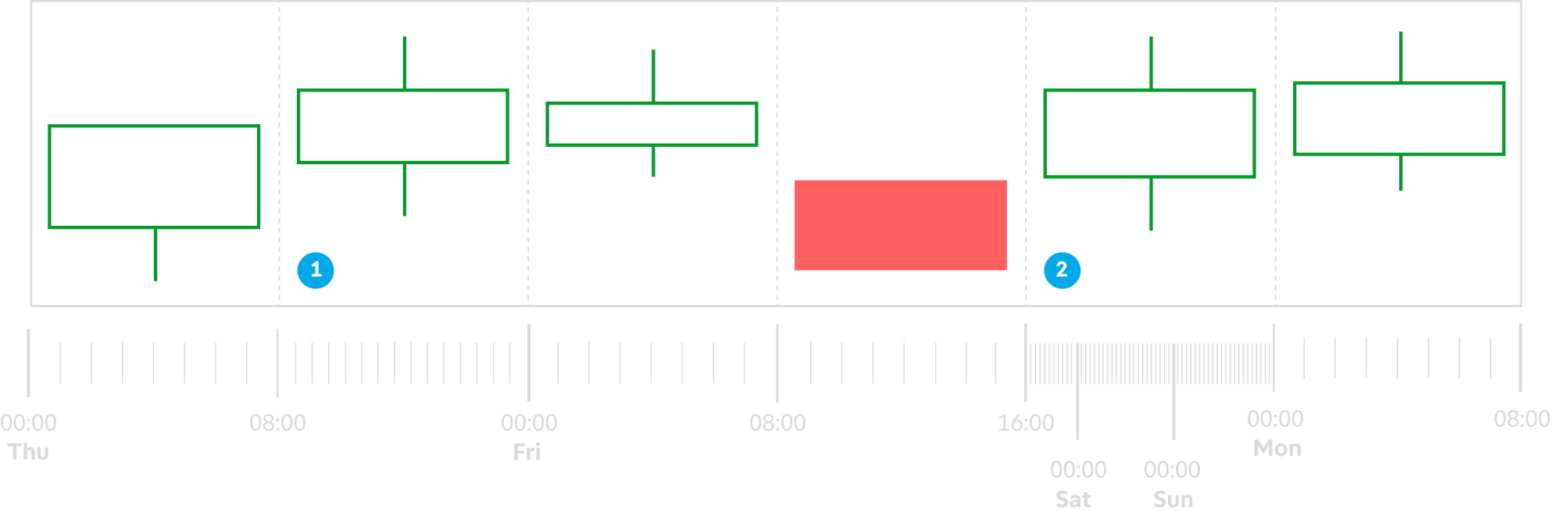
For example, in a candle time chart with an 8-hour aggregation period and extended session data, each candle typically represents an 8-hour interval. However, if an aggregation period has no trading data, time is compressed in half and both intervals are represented by one candle. In this scenario, the candle spans 16 hours (see label 1).
Time axis compression mainly occurs during the weekends. In our example, because there is no trading data for Saturday and Sunday, the time interval on Friday’s final candle spans 56 hours (8 hours from Friday’s trading session plus 48 hours for both weekend days, as seen on label 2).
For tick-based charts, an aggregation period’s time is irregular, as it represents the completion of a number of ticks (trade). However, the time interval logic is the same: the interval spans from the start time of the current candle to the start time of the next one.
Features using Time Axis
Drawings on Charts
Drawings are stored and mapped based on the timestamp of the points (selected using the mouse). This timestamp is determined by the time axis on the chart, not the aggregation period’s start time.
Highlight Extended-Hours Trading session
The Extended-Hours Trading session also uses the time axis on the chart to determine where highlighting is applied. The section highlighted represents the time interval on the time axis outside regular trading hours.