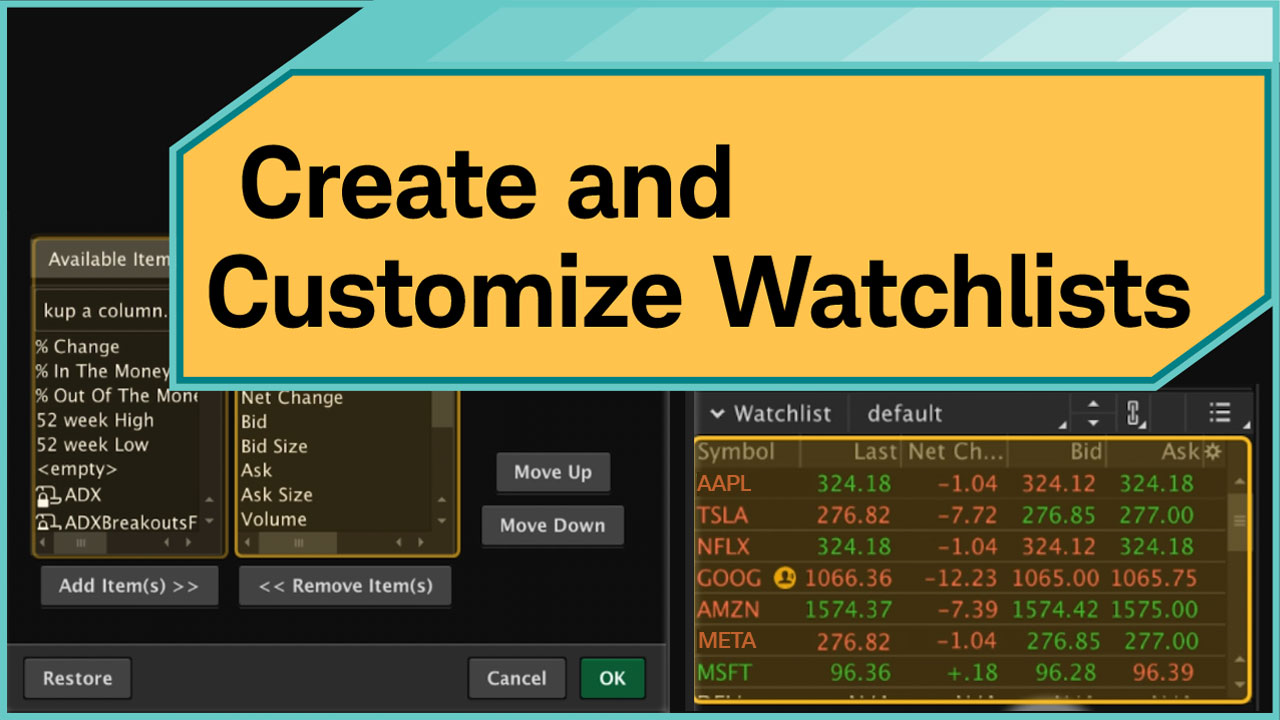
The Visualize tab provides you with visual analytics of market activity for the selected watchlist. The Visualization menu in the header allows you to switch between the Heat Map and Index Watch modes. The interface adjusts dynamically to display the data and controls relevant to the selected mode.
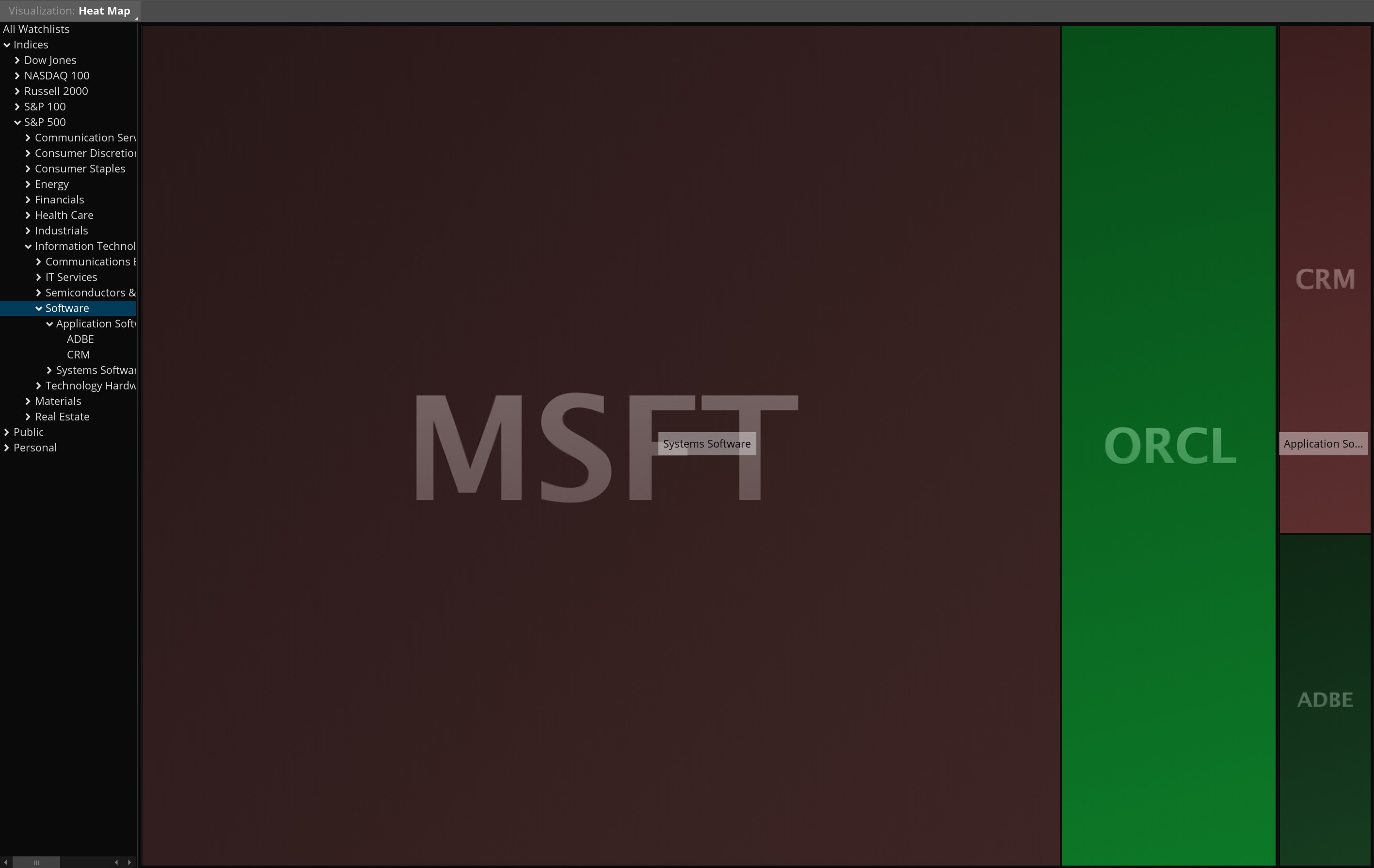
Heat Map
In the Heat Map mode, the left panel displays public, personal, and index watchlists. This panel provides quick access to symbol groups.
To explore data in the Heat Map mode:
- Select a watchlist from the left panel.
- View the main area which displays symbols as colored boxes. Box color indicates price direction: by default, gains are shown in green and losses in red. Color saturation is proportional to the magnitude of the change, with more saturated colors showing stronger moves. The size of each rectangle box is proportional to the company’s market capitalization.
- Hover over a box to view details such as company name, last price, percentage change since the market open, and market capitalization.
- Left-click a box to open a context menu that allows you to copy the symbol, add personal notes, link the symbol to other components by color, or access additional market data such as market depth, charts, company profiles, trade entry, alerts, news, and analysis.
- Right-click a box to open a watchlist menu which can be used to navigate through available public and custom watchlists.
- Hold the SHIFT key and click on a box to drill down into the hierarchy of watchlists. For example, clicking on the Software subsector zooms in to display its subgroups such as Application Software and Systems Software.
*For illustrative purposes only. Not a recommendation of a specific security or investment strategy.
Past performance is no guarantee of future performance.
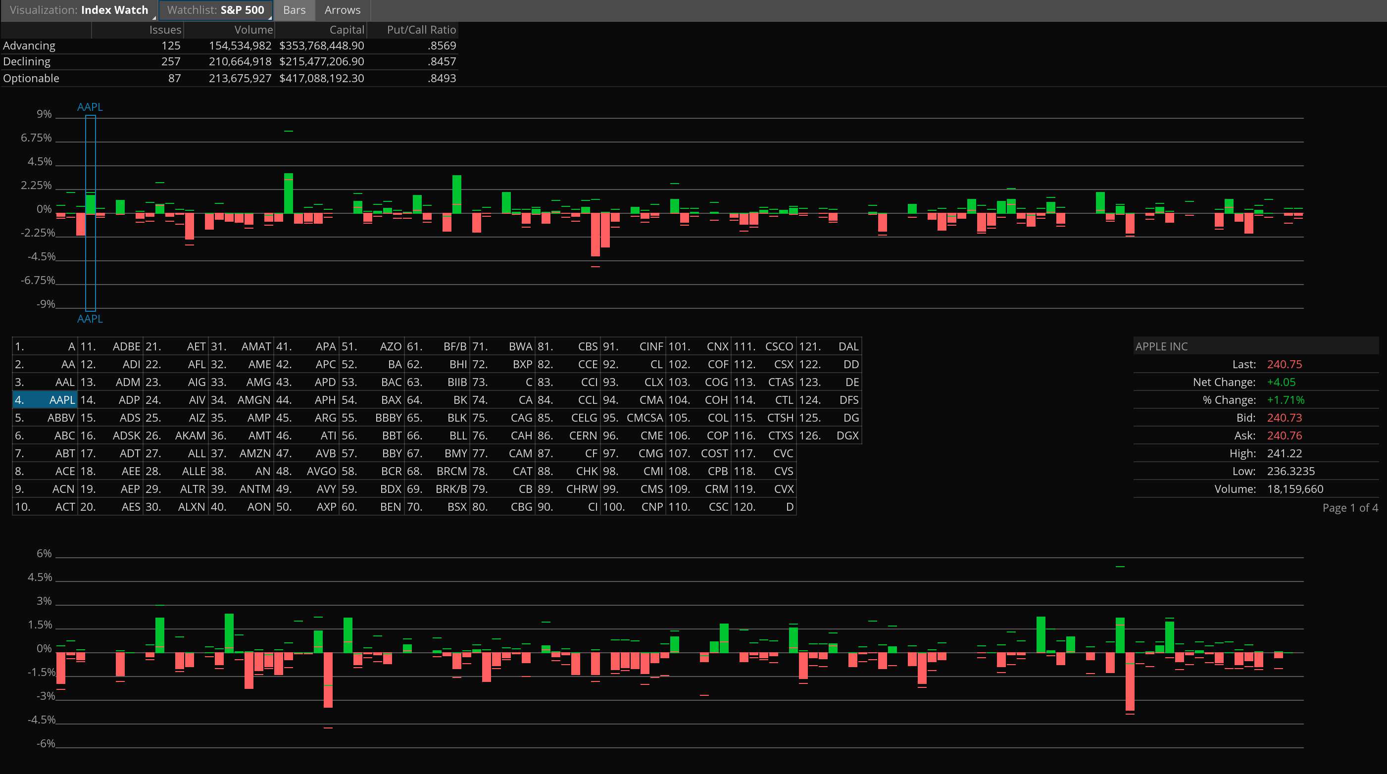
Index Watch
In the Index Watch mode, the focus is on the intraday index performance of a watchlist, which can be selected in the header.
To analyze data in the Index Watch mode:
- Select a watchlist from the header to display its intraday performance as a bar chart.
- Choose whether to display performance as bars or arrows using the header controls. By default, green bars/arrows indicate advancing stocks, and red ones indicate declining stocks.
- Hover over a bar or arrow to view symbol details in the information pane on the right. The details include last price, net and percentage changes, bid and ask prices, daily highs and lows, and volume.
- Left-click a bar or arrow to open a menu of symbol actions: copy the symbol, add personal notes, link the symbol to other components by color, or access additional market data such as market depth, charts, company profiles, trade entry, alerts, news, and analysis.
Note: For long watchlists, the display is divided into multiple chart pages stacked vertically. Each page contains its own bar chart and symbol table, and the Y-axis scale is calculated based only on the symbols shown on that page. As a result, Y-axis values will differ between pages and are not directly comparable.
*For illustrative purposes only. Not a recommendation of a specific security or investment strategy.
Past performance is no guarantee of future performance.