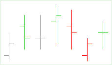
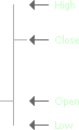
The Bar chart shows aggregated data for open, high, low, and close price values as a vertical line with two horizontal dashes. The bottom end of the line indicates the low price and the top of the line indicates the high price. The left-hand dash is used to show the open price and the right-hand dash shows the close price.
Algorithm
- Up tick color. If the current close price is higher than the previous close.
- Down tick color. If the current close price is lower than the previous close.
- Neutral tick color. First bar on the chart or if the current and previous close prices are equal.
You can customize the color scheme and line width of the Bar chart. For more information, see Appearance Settings.
Sample
Bar chart
Bar breakdown:
Default Colors
|
Component |
Dark L&F |
Light L&F |
|---|---|---|
|
Up Tick |
|
|
|
Down Tick |
|
|
|
Neutral Tick |
|
|